Case study · Kohl’s · Payments · Enterprise · AI-assisted design

Bank Reconciliation — the dashboard we didn’t build.

Everyone assumed the answer was a dashboard. Research showed the real problem was effort, not visibility — so we shipped something simpler that the finance team approved on first review.

ROLE
Lead Product Designer
TEAM
Product, Data Engineering, Finance
TIMELINE
Dec 2025 — May 2026
DOMAIN
Payment Order Modernization (POM)
6+ systems 1 email
Daily 8 AM digest replaces manual data-gathering across Mobius, Worldpay IQ, Amex, Discover, bank files and 4 spreadsheets
Exception-first
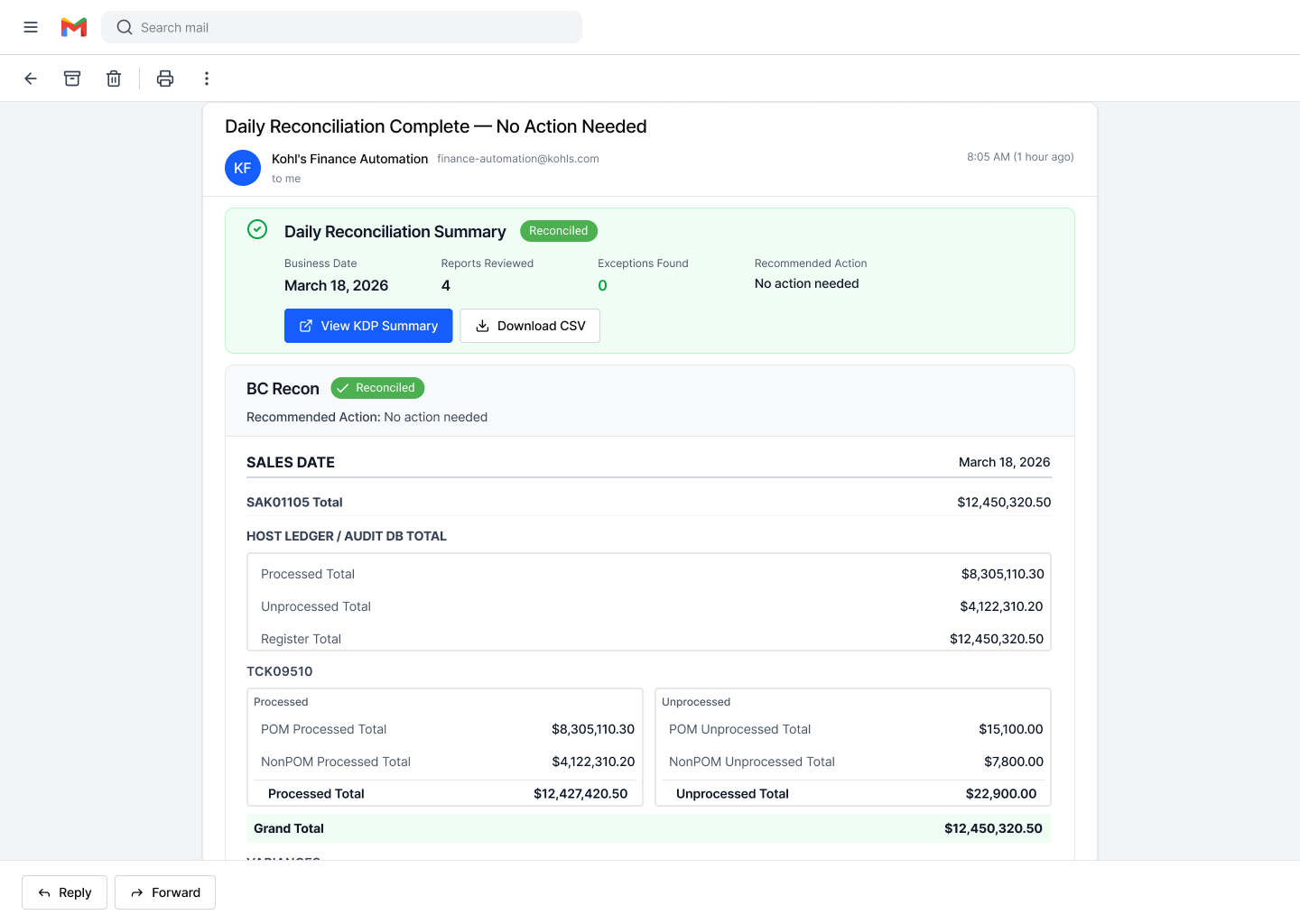
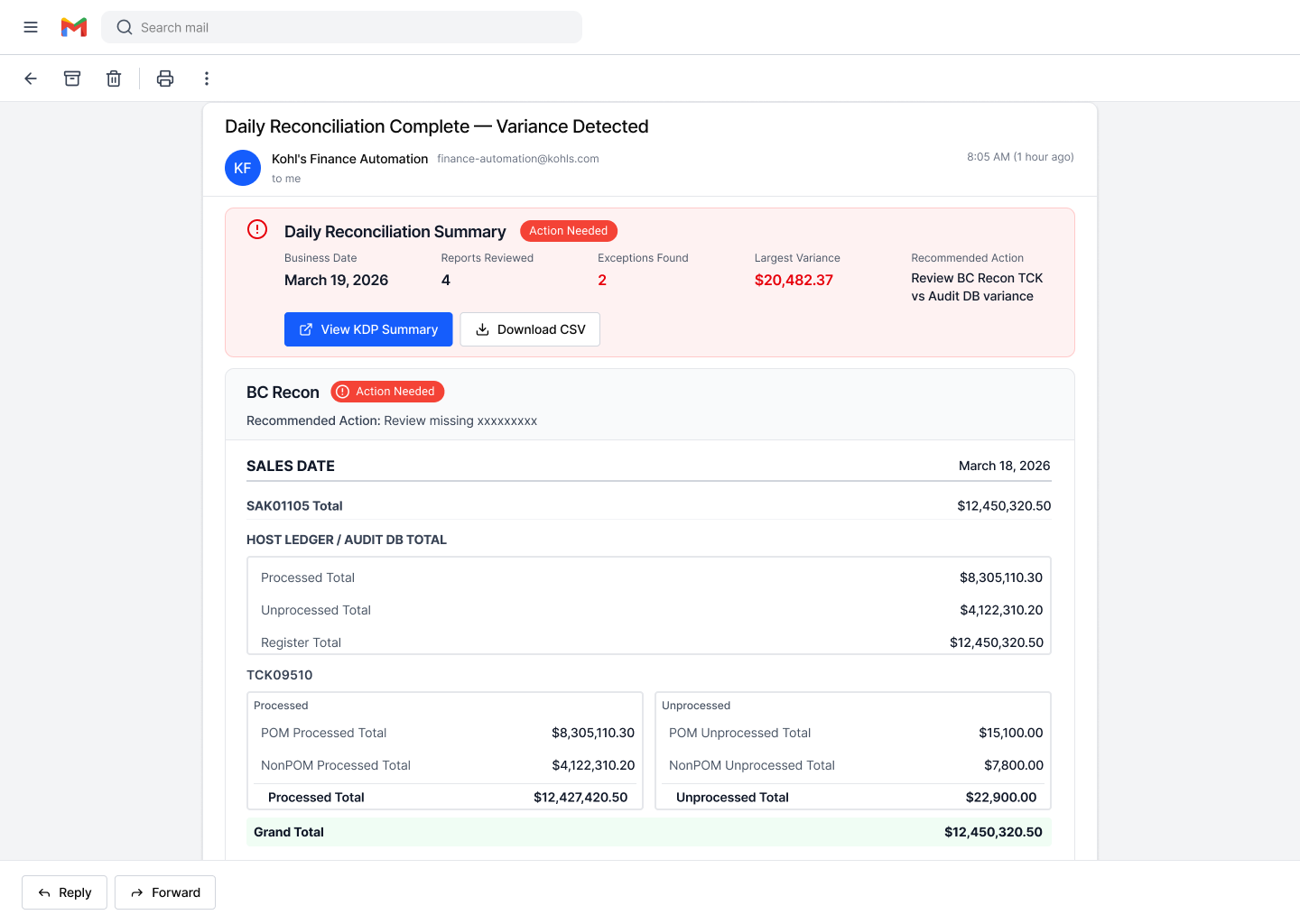
Variances surface the moment the email opens — with the recommended action inline
Approved, in build
Prototype approved by the finance team on first review; engineering picked it up for implementation
Context

Every day, three sets of numbers must agree.

Bank reconciliation is the daily process of proving that what the registers recorded, what was sent to card processors, and what the bank actually funded all tie out. When they don’t, the team investigates: expected timing? Carryover? A real problem?

Kohl’s was mid-migration from a legacy mainframe payment switch to Aurus, a modern orchestration platform — a hybrid state where both flows run side by side and financial trust cannot slip, even for a day.

REGISTERS
“What the registers say we charged” — mainframe summary reports
↓ must match ↓
PROCESSORS
“What we sent for settlement” — nightly batch files to card processors
↓ must match ↓
BANK
“What was actually funded” — wire amounts received at the bank
The problem

The team wasn’t investigating issues — they were gathering data.

4
separate Excel spreadsheets stitched together daily, by hand
6+
systems and portals to swivel-chair between every morning
12,000+
pages of audit PDF to search when an auditor asks a question
10 PM
hard settlement cutoff creating error-prone carryover math

One mis-keyed carryover could throw off the entire daily reconciliation. Critical adjustments, formulas, and institutional knowledge lived in spreadsheets — outside any system, and hardest on newer team members.

Discovery

Before designing anything, I learned the system to the table level.

Workflow walkthroughs with Finance

Sat with the reconciliation analysts through their real morning routine — how they calculate the expected wire, handle chargebacks, rejects, fees, and the Monday triple-backlog.

End-to-end system mapping

Mapped the full flow from register to bank across three states — current, hybrid, and future — so every stakeholder shared one picture of the migration.

Technical sessions with data engineering

Traced how register and settlement data actually populate the mainframe tables, and validated what could realistically be unified in BigQuery.

Rapid AI-assisted prototyping

Used AI-assisted design workflows to turn early concepts into tangible, testable prototypes in days — keeping validation continuous instead of a phase.

The reframe
We stopped asking
“What dashboard should we build?”
And started asking
“How might we reduce reconciliation effort and make exceptions immediately actionable?”

The dashboard assumption made sense on the surface — dashboards are the default answer to reporting-heavy workflows, and stakeholders wanted visibility. But research showed visibility wasn’t the bottleneck:

The existing vendor portal already surfaced reconciliation data — and still didn’t solve the problem
Users still stitched data across sources; spreadsheets still did the critical work
Most effort went into figuring out which variances actually mattered

A dashboard would still require users to log in, gather, and interpret. The effort would move — not disappear.

Options we weighed

I documented four options in a decision doc, weighing each against the hybrid-state reality, audit requirements, and the team’s actual workflow.

OPTION A
Vendor portal as-is

Existing tool, transaction-level data — but no legacy view, unstable prior-day data for audit trails, and blind to the legacy flow.

Ruled out
OPTION B
Custom dashboard

Could unify every source — but heavy engineering investment, long-term maintenance, and users still gather and interpret daily.

Deferred
OPTION C
Slack notifications

Exception-based and automated — but a chat-first workflow didn’t match how this finance team communicates and documents.

Ruled out
OPTION D
Automated daily email

All sources reconciled in BigQuery, delivered in the team’s preferred medium — exception-first, copy-paste compatible with their spreadsheets.

Selected
The solution

A structured morning digest — the whole reconciliation, assembled before the team sits down.

Delivered by 8 AM daily

Key totals across all tender types, already assembled — carryover math included.

Exception-first logic

Confirms when everything balances; surfaces only what needs attention when it doesn’t.

Fits the existing workflow

Figures copy-paste into the team’s spreadsheets; ADA-compliant iconography; legacy reports retained as fallback.

Validation
It provides the exact figures we need without paging through multiple documents — and having the variances identified immediately is an improvement.
Lead reconciliation analyst · Finance team review

The finance team approved the prototype on first review. Both scenarios — balanced and variance — tested against real-world figures, and the team confirmed the format integrates directly into their current workflow.

Engineering picked up the work for implementation immediately after, with legacy reports retained as a fallback so financial trust never depends on a single channel.

Reflection

The most valuable thing I designed was the question.

This project shows what product design contributes beyond the interface: challenging the assumed solution, rebuilding trust by involving users in the process, connecting user needs with technical feasibility — and having the discipline to recommend the simpler answer when the evidence points there.

The team didn’t get the dashboard they asked for. They got their mornings back.