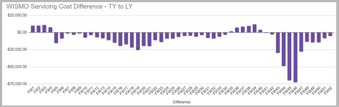
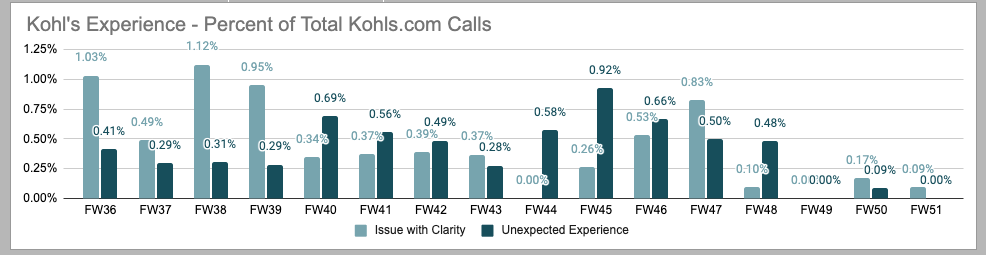
“Where is my order?” calls made up roughly 10% of all Kohl’s customer-service inquiries. With peak season 30 days away, we had three weeks to reduce them — using research-driven, low-tech changes, not a replatform.
Since 2019, “Where is my order?” inquiries had hovered around 10% of all Kohls.com customer-service contacts. When the project began in October 2021, the cost of handling those calls alone stood at $500K year-to-date — before counting customer ill-will and remediation costs.
This was my first project, in my first month at Kohl’s — new to the company, new to the tools, and entrusted with a time-sensitive, cross-departmental problem with peak season 30 days out.
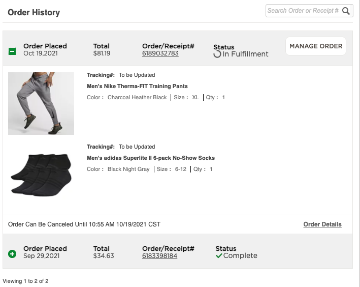
Click-tracking on Order History showed the Order/Receipt Number had the highest engagement — customers clicked it expecting tracking updates. Interface labeling and user intent were misaligned at the most important moment.
In unmoderated remote testing with a clickable prototype, users confused tracking with order details and named estimated delivery date as the most valuable piece of information.
“It wasn’t clear to me if the two items were shipped together or separately.” — usability participant
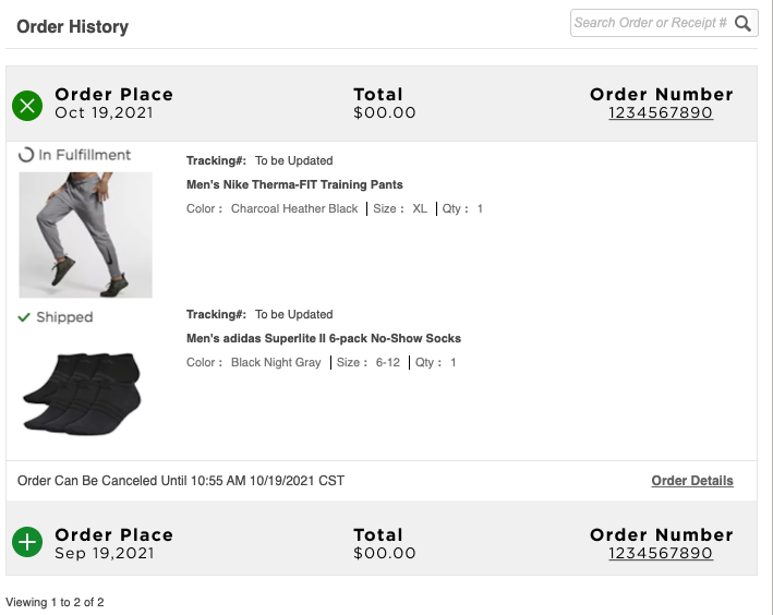
Call reviews and live agent interviews traced WISMO volume to confusing or missing tracking links, inconsistent link formats, broken carrier URLs — and statuses like “In Fulfillment” and “Complete” that added confusion instead of clarity.
Pre-scan delivery estimates from the tracking vendor set false expectations before carriers ever scanned a package, and tracking info differed between email and digital channels — the experience contradicted itself across touchpoints.
Estimated dates were shown before carriers scanned packages, creating expectations the system couldn’t keep. Working with the tracking-vendor integration team, we removed pre-scan estimates and aligned the experience with actual carrier data — eliminating contradictory information and restoring trust in the delivery timeline.
Across desktop, mobile web, and the native app: tracking and delivery status moved front and center, the Order ID was visually separated from tracking links to prevent misclicks, and ambiguous labels like “In Fulfillment” were removed or replaced based on user and agent input. We validated with a second round of UserZoom testing — users interpreted their order status accurately without assistance.
An audit found 12–15% of tracking links broken, outdated, or mapped to the wrong carrier — and email links behaved differently from on-site ones. We migrated 91% of URLs to a single branded tracking experience and initiated a longer-term automation plan to prevent link degradation across platforms.
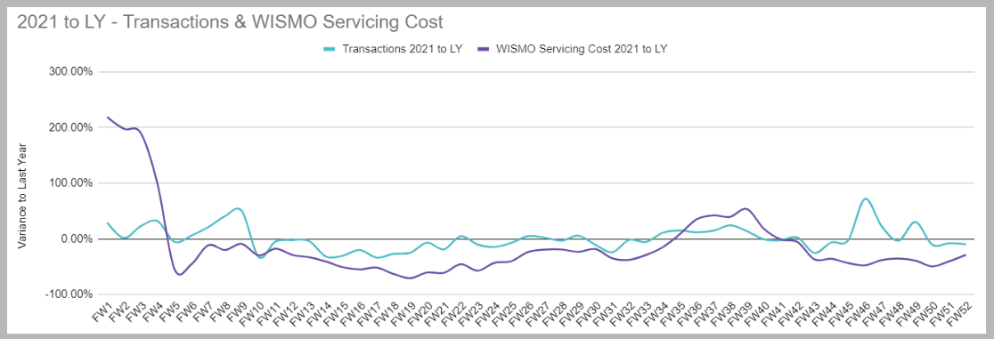
Due to the sensitive nature of Kohl’s financial and customer-operations data, specific internal metrics and full documentation are excluded from this case study.


This was my first assignment at Kohl’s — three weeks into the job, spanning Customer Experience, Order History, Wallet & Account, and Engineering. I grounded every decision in real user pain points and agent feedback, using research to influence outcomes even in areas outside my direct ownership.
It taught me that great UX isn’t only about the interface — it’s clarity, collaboration, and composure under pressure. Thoughtful, user-centered changes — even low-tech ones — can create extraordinary value for customers and the business alike.